

Alejandro Perdomo Daniels & Maria Rudy — Matters of Contiguity
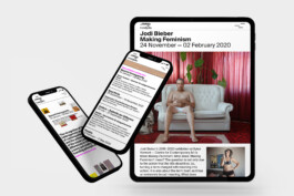
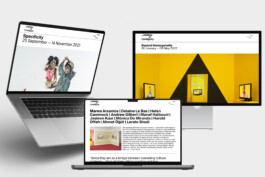
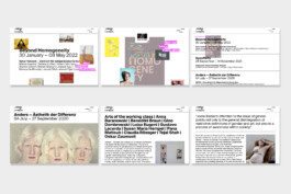
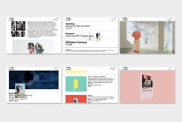
Corporate Design, Screen Design & Website, Social Media Concept
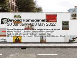
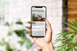
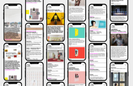
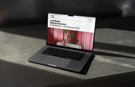
For the past five years, Matters of Contiguity — formerly “Works on gender and identity” — has conceived, organized and curated exhibitions of critical contemporary art, in which works by international artists are exhibited. These exhibitions take place in cooperation with various museums, foundations, art– and cultural institutions. To accompany the art exhibitions, MoC publishes exhibition publications in which they create spaces for discourse and discussion based on theoretical elaborations. MoC describes its exhibition series as a “practice of curatorial activism and cosmopolitan plasticity”. For the release of the new name we developed — in close exchange with MoC — a new brand & web presence. In the development phase of the logo, we engaged with MoC’s texts. We were looking for a characteristic in MoC’s writing style and came across the recurring use of the dash.
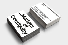
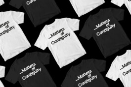
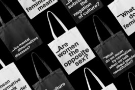
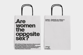
In its dynamic, the dash has a fluid feel, as it is always moving forward, visualizing the flow of thoughts. The idea that a dash allows for an endless continuation of thoughts seemed to us to be a fitting symbol for discourse formation, as well as the constant forward thinking in MoC’s work. Thus, we used the symbol of the dash in the development of the logo — as connections between letters.


Alejandro Perdomo Daniels & Maria Rudy — Matters of Contiguity
Corporate Design, Screen Design & Website, Social Media Concept

For the past five years, Matters of Contiguity — formerly “Works on gender and identity” — has conceived, organized and curated exhibitions of critical contemporary art, in which works by international artists are exhibited. These exhibitions take place in cooperation with various museums, foundations, art– and cultural institutions. To accompany the art exhibitions, MoC publishes exhibition publications in which they create spaces for discourse and discussion based on theoretical elaborations. MoC describes its exhibition series as a “practice of curatorial activism and cosmopolitan plasticity”. For the release of the new name we developed — in close exchange with MoC — a new brand & web presence. In the development phase of the logo, we engaged with MoC’s texts. We were looking for a characteristic in MoC’s writing style and came across the recurring use of the dash.


In its dynamic, the dash has a fluid feel, as it is always moving forward, visualizing the flow of thoughts. The idea that a dash allows for an endless continuation of thoughts seemed to us to be a fitting symbol for discourse formation, as well as the constant forward thinking in MoC’s work. Thus, we used the symbol of the dash in the development of the logo — as connections between letters.
